David Schnitman

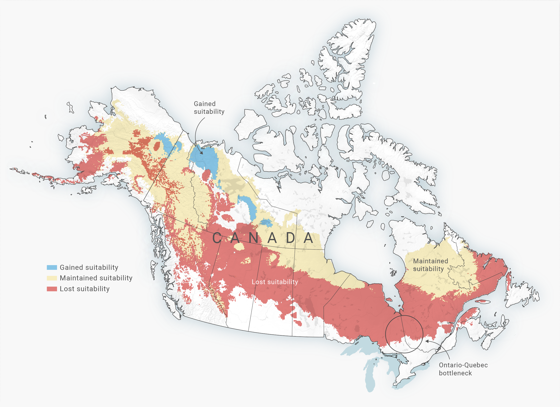
The habitable range of Caribou in 2080.
The habitable range of the Boreal chickadee in 2080.
The habitable range of Moose in 2080.
The habitable range of the Bombus Affinis bee comparing data from 1901–1974 with data from 1999–2010.
The habitable range of the Bombus Pensylvanicus bee comparing data from 1901–1974 with data from 1999–2010.
PROCESS WORK: Original raster map of the Caribou's habitable range from the PLoS One Journal.
PROCESS WORK: Reprojected the coordinate reference system and added a terrain texture.
PROCESS WORK: Changed the colour scheme and opacity of the coloured areas to better denote their meaning.
Species shift
Climate change is redrawing the boundaries of species habitats. On average, land-based species are moving toward the cooler poles at a rate of 17km a decade. Maps were produced for a Toronto Star story about the effects of climate change on bumblebees, caribou and other species. In May 2018, Toronto Star science reporter Kate Allen won a National Newspaper Award in the category of Best Explanatory Work for her work on this story.

PROCESS WORK: Image treatment.
PROCESS WORK: Type exploration.
PROCESS WORK: Mobile user interface mockups.

PROCESS WORK: Colour exploration.
PROCESS WORK: Mobile and desktop mockups.
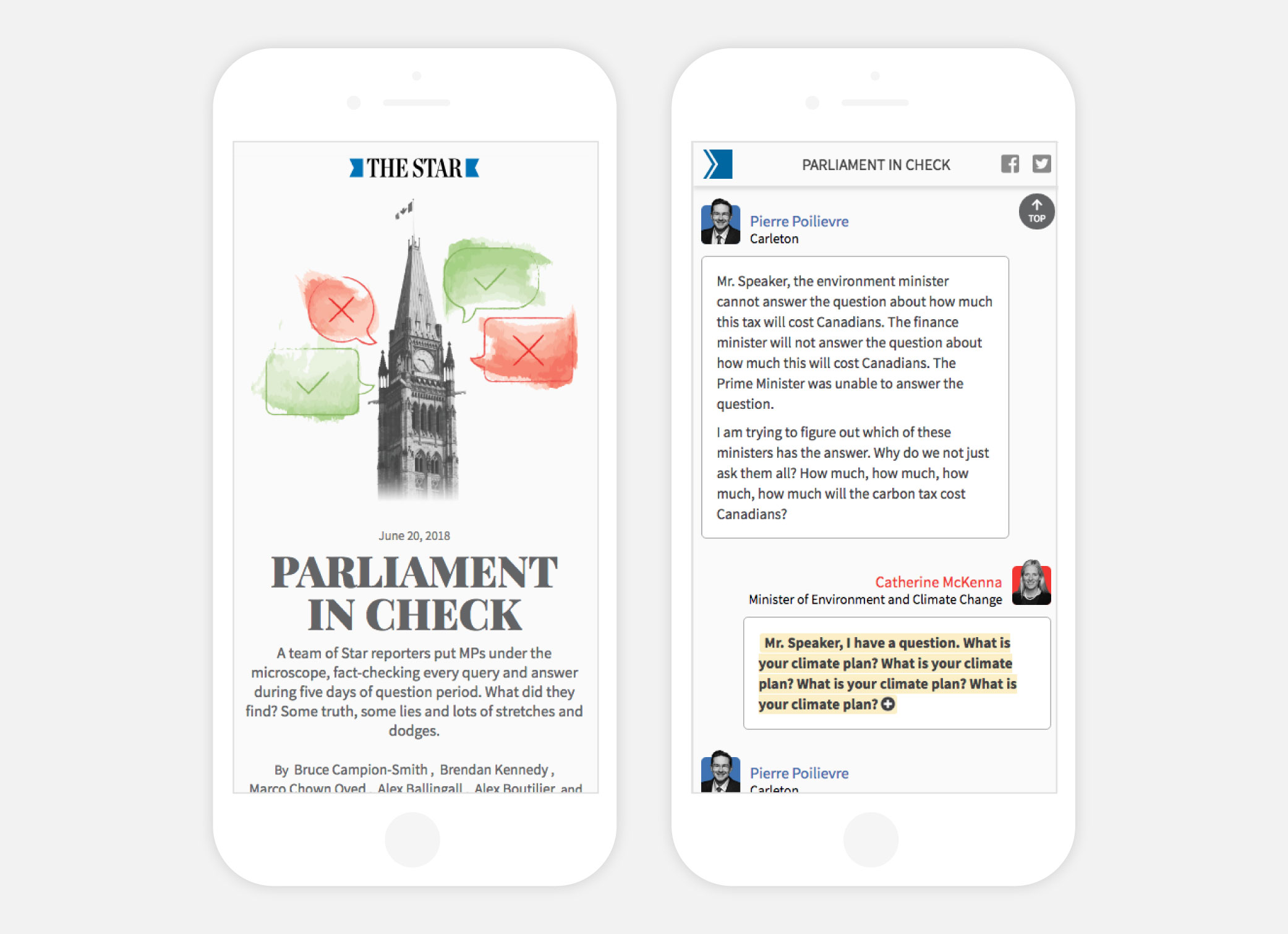
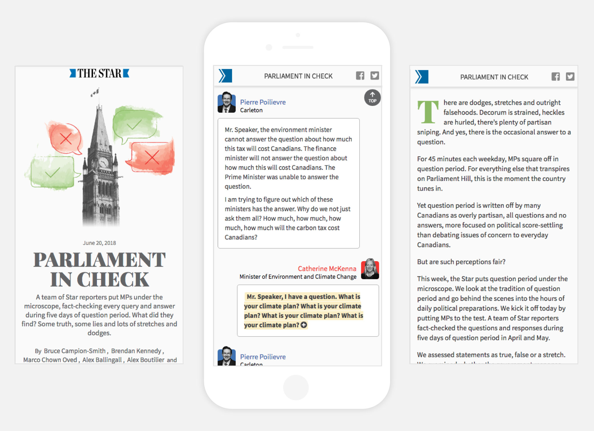
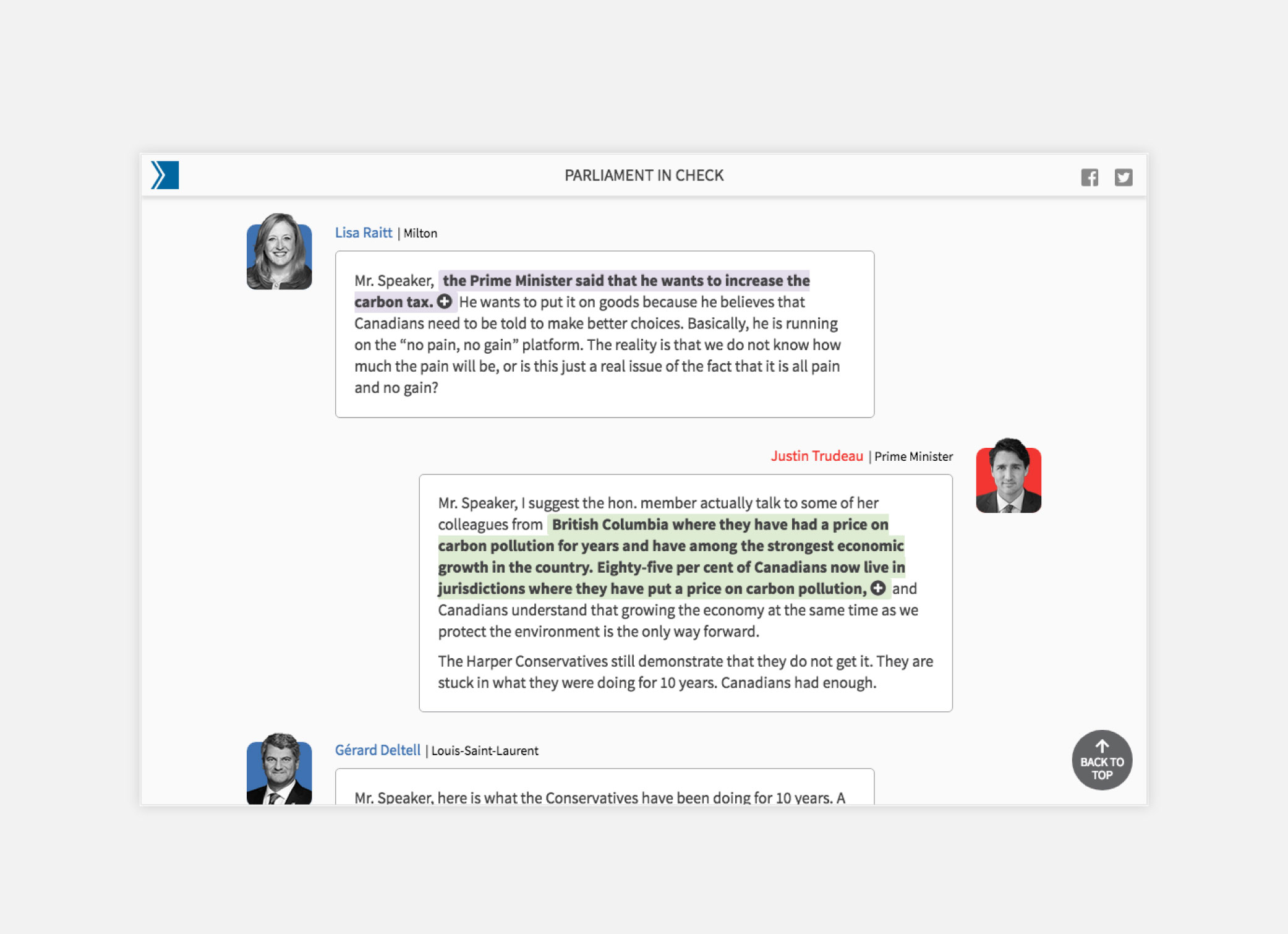
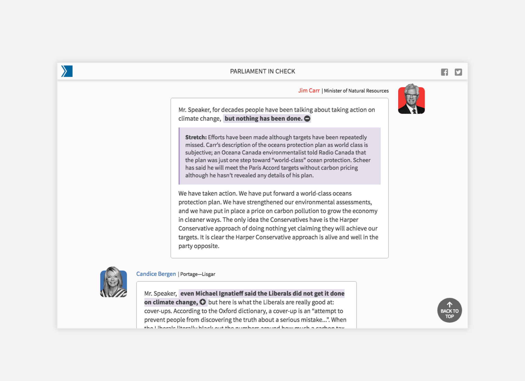
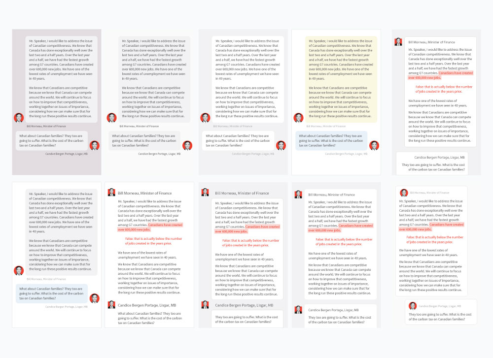
Parliament in Check
A team of Toronto Star reporters fact-checked five days of question period in the House of Commons. My team developed a news app to allow users to read and filter the text transcript of the Hansard with colour coded annotations depending on whether or not the MPs statements were true, false, dodges or stretches. I designed an intuitive user interface, similar to a chat messenger or texting application to communicate the back and forth nature of exchanges between the government and opposition parties.


Motherisk
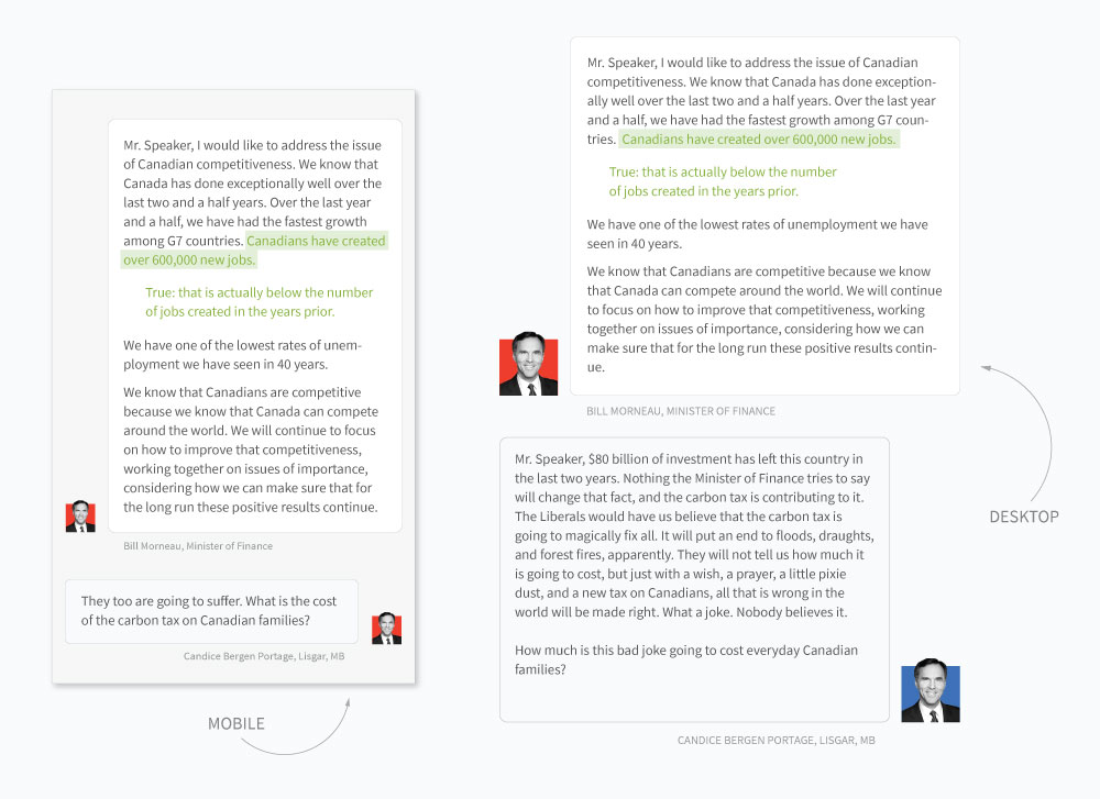
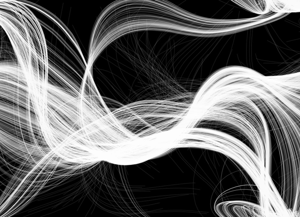
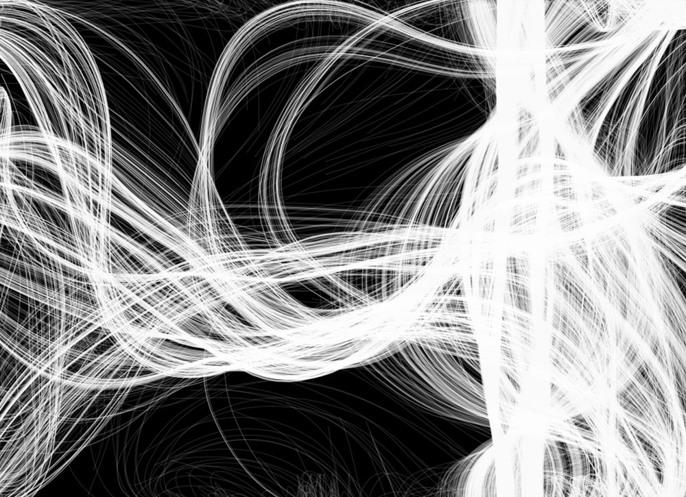
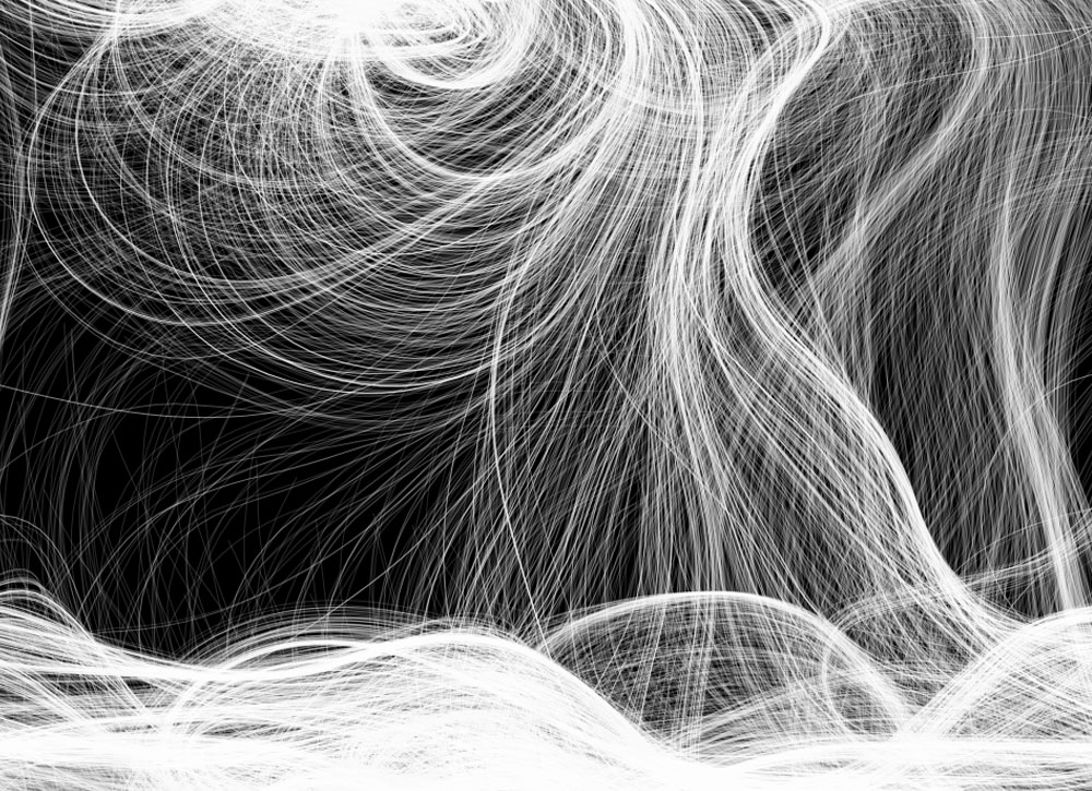
Editorial design for a Toronto Star investigation into flawed hair tests performed by a lab at the Hospital for Sick Children, which had significant effects on cases where decisions were made to remove children from their families. This story did not have a single principle character or signifier, which gave our team the opportunity to use a generative design introduction. I used a Perlin noise algorithm in p5.js to render randomized flowing strands of hair. The Toronto Star’s Rachel Mendelson later won a CAJ award for her investigation into Motherisk.

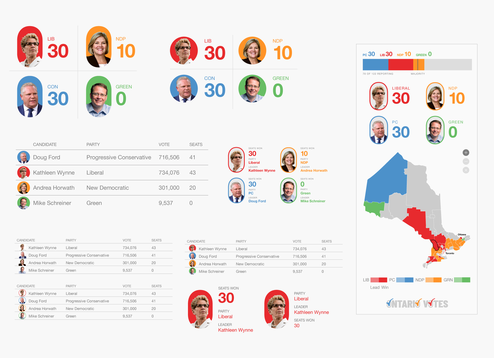
PROCESS WORK: User interface mockups of text feeds, party results and a preliminary mobile dashboard.
PROCESS WORK: Election branding for Instagram stories.
PROCESS WORK: Mockup of desktop user interface with party results, text feeds, stacked bar and interactive map.
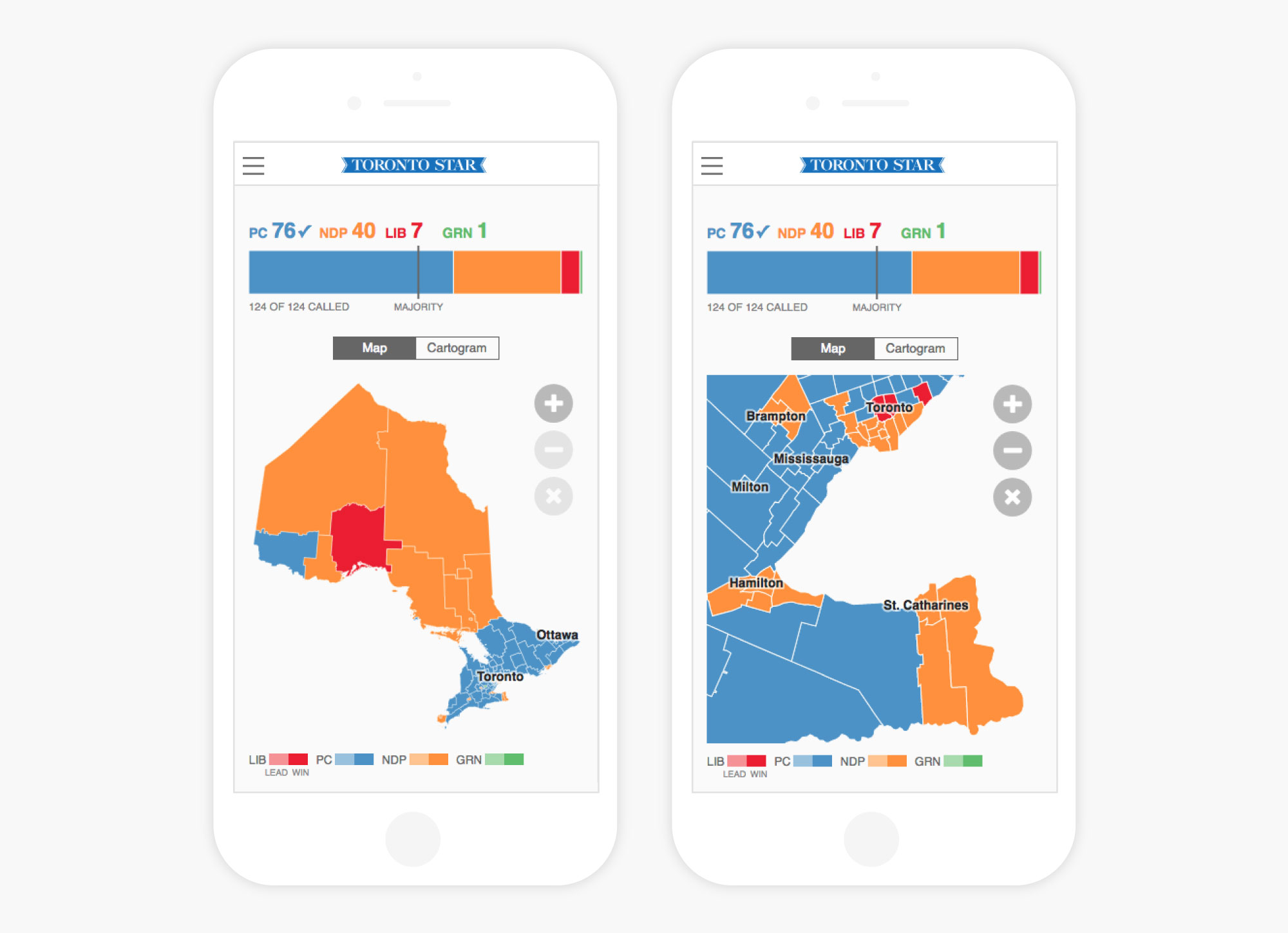
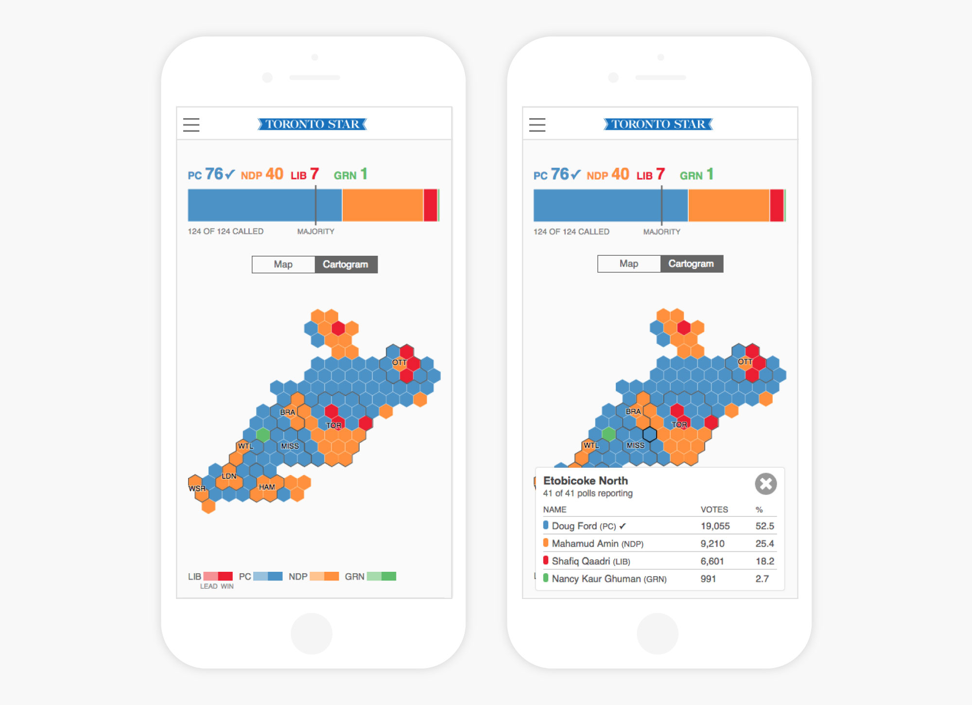
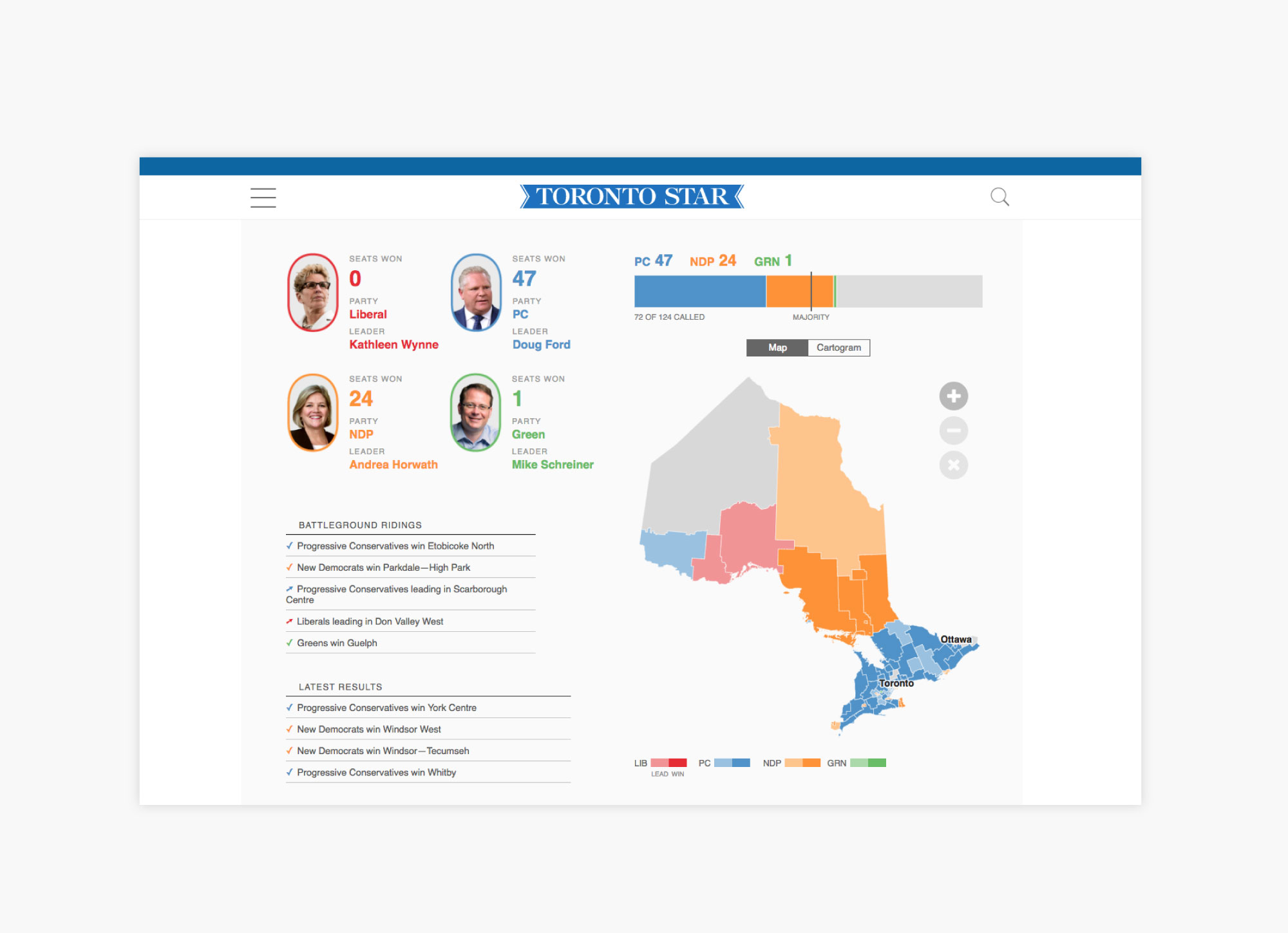
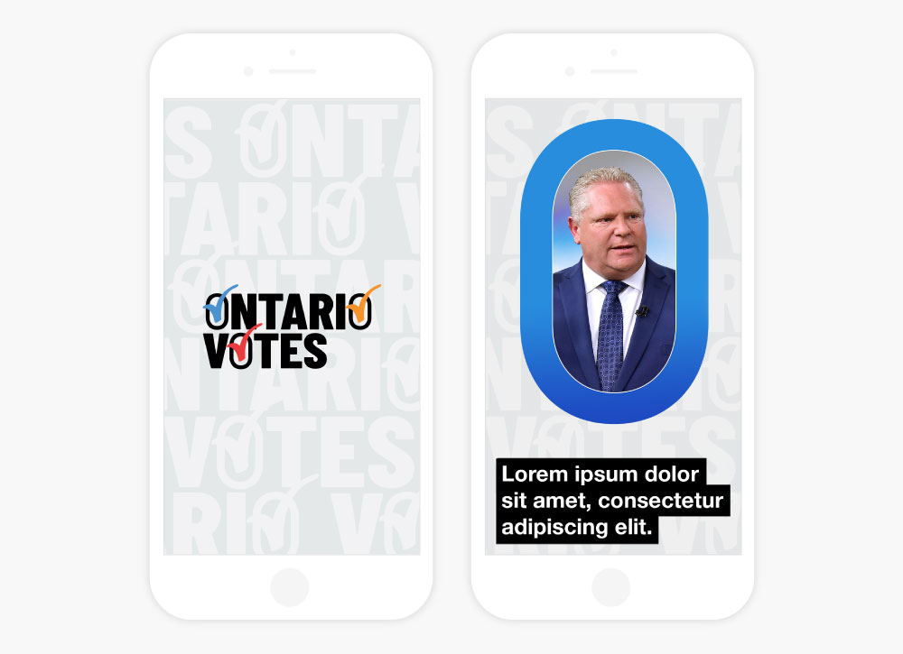
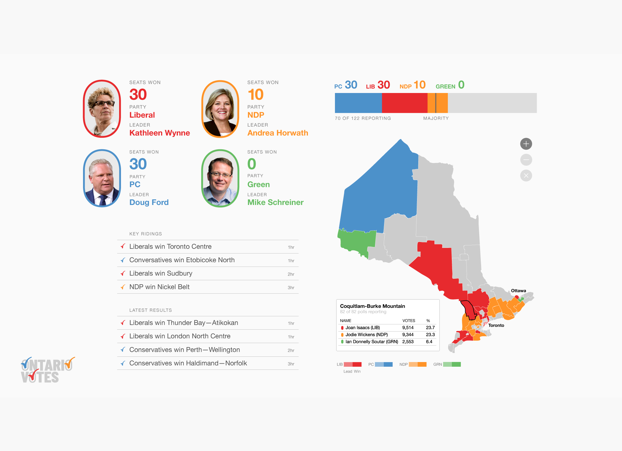
Ontario Votes 2018
The province of Ontario held a general election on June 7, 2018. A centrepiece of the Toronto Star’s extensive election coverage was a dashboard which mapped the results of the vote in real time. A JSON feed of data populated a front-end user interface which comprised of a map, cartogram, stacked bar and text feed. Users could navigate the map to determine which candidates won in their riding. Particular emphasis was put on usability for mobile devices. Developed by Cameron Tulk. In addition to the dashboard, I created a visual identity was designed for the election for use on social media.
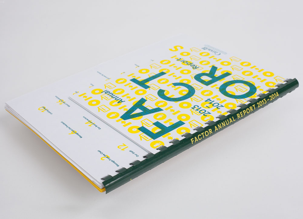
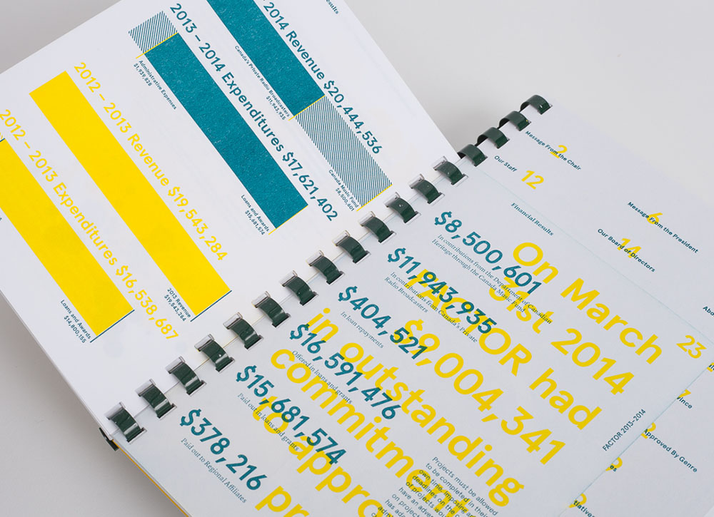
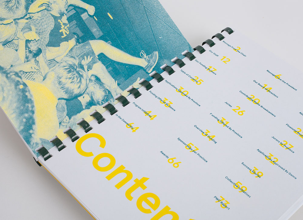
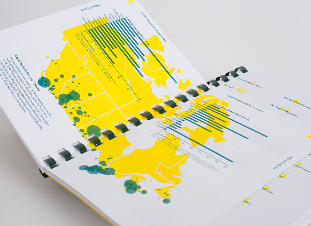
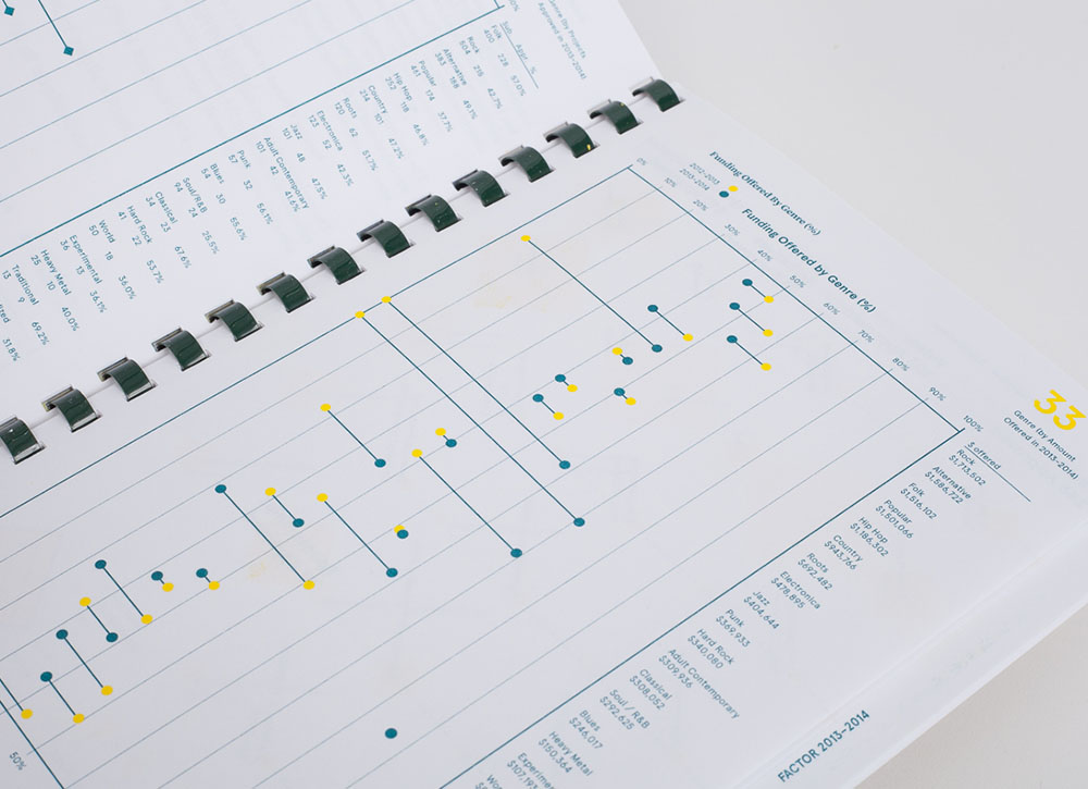
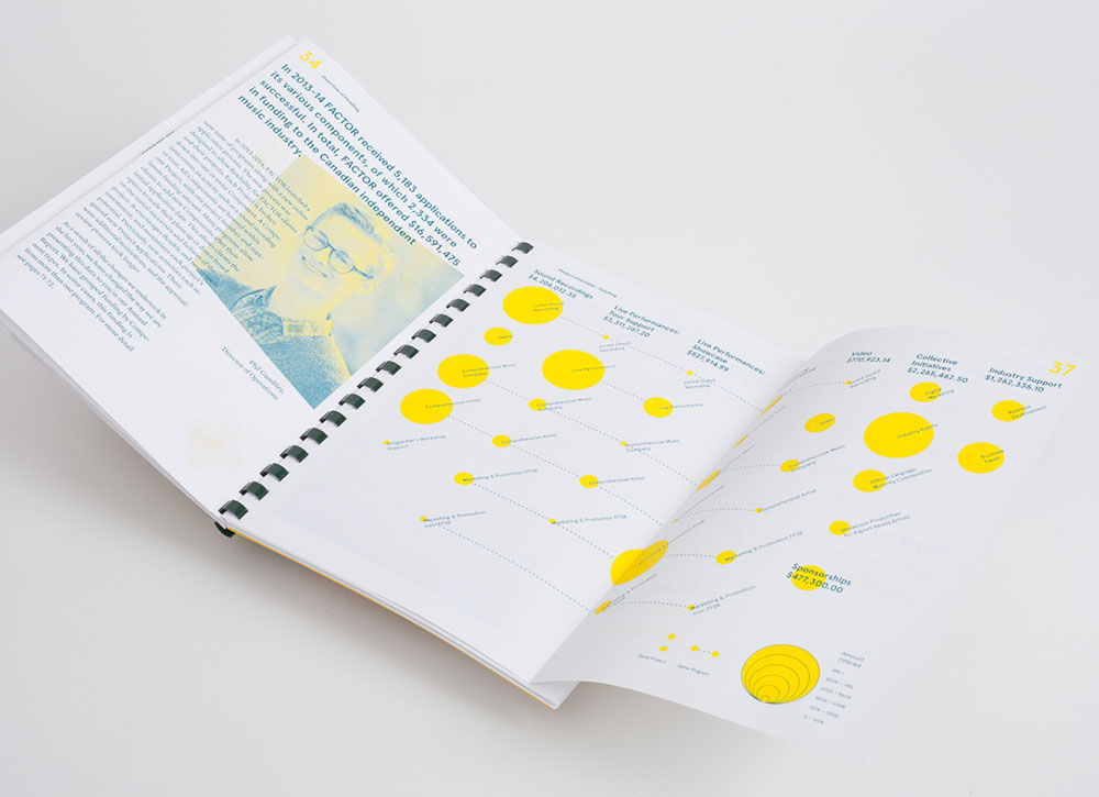
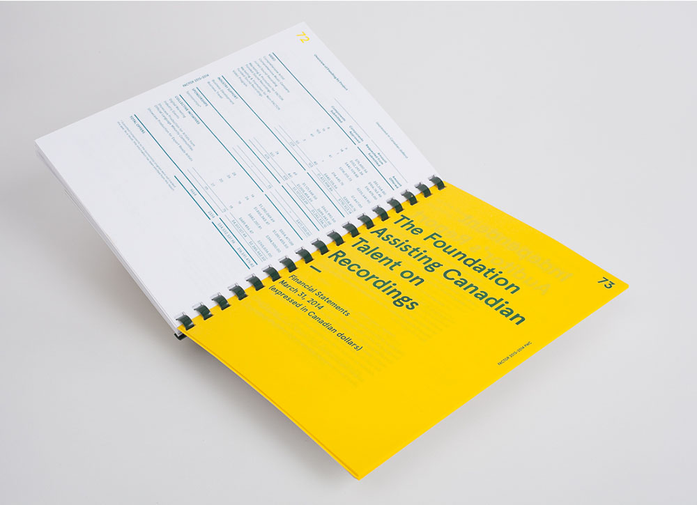
Factor 2014
FACTOR is a private non-profit organization that helps fund Canadian musicians. FACTOR's 2013–2014 Annual Report details how the organization oversaw applications, distributed funding, managed programs, and sponsored events. The diversity of FACTOR’s efforts are displayed through a variety of visualization techniques throughout the book, including: proportional symbol mapping, matrix diagrams, scatter plots, illustrative infographics, bar charts, and tables. The report was printed using a two-tone Risograph printing method. Designed at ALSO Collective with Ansel Schmidt.
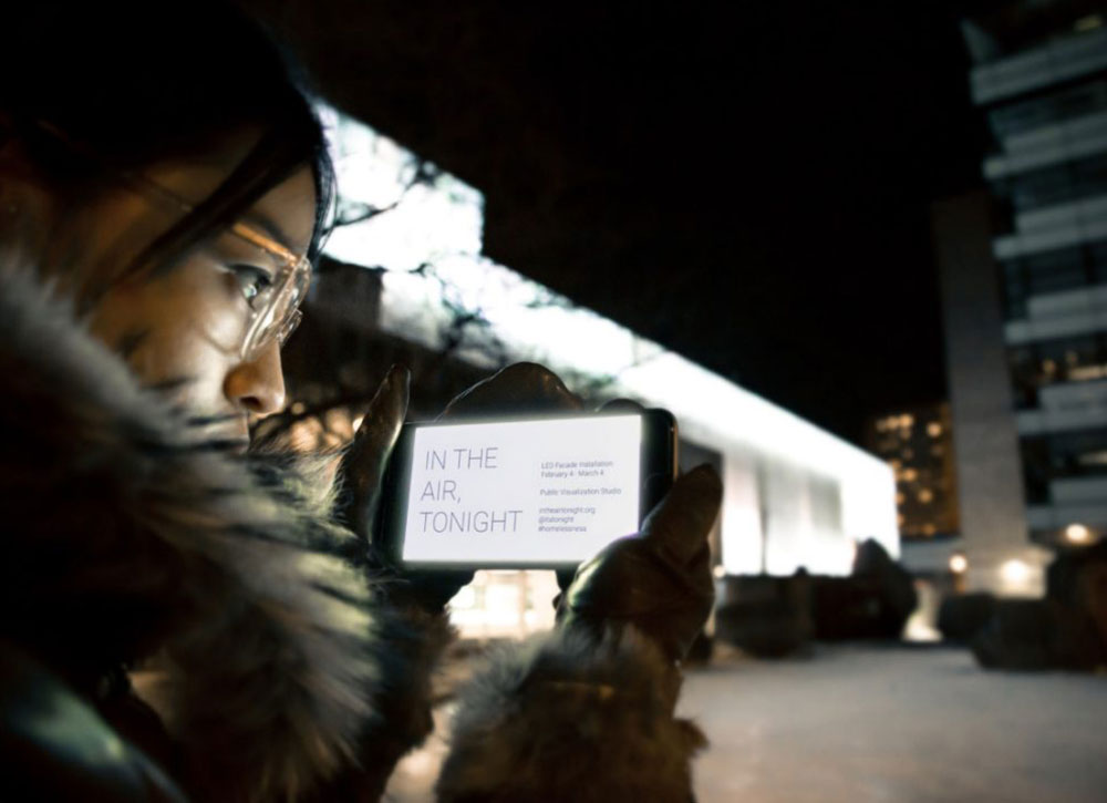
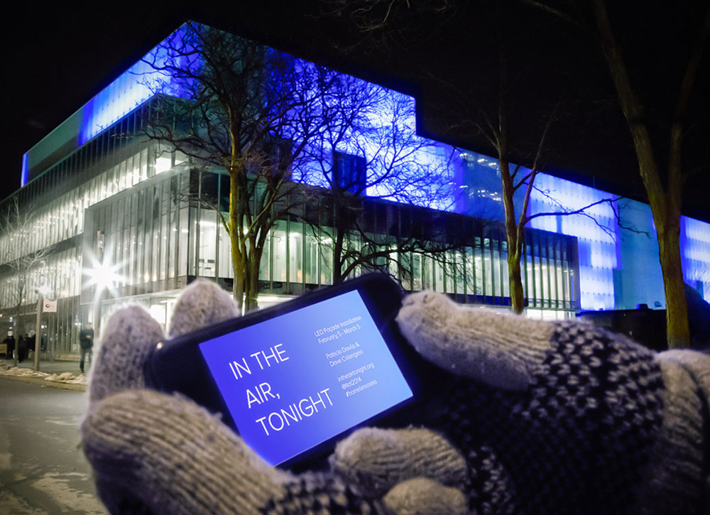
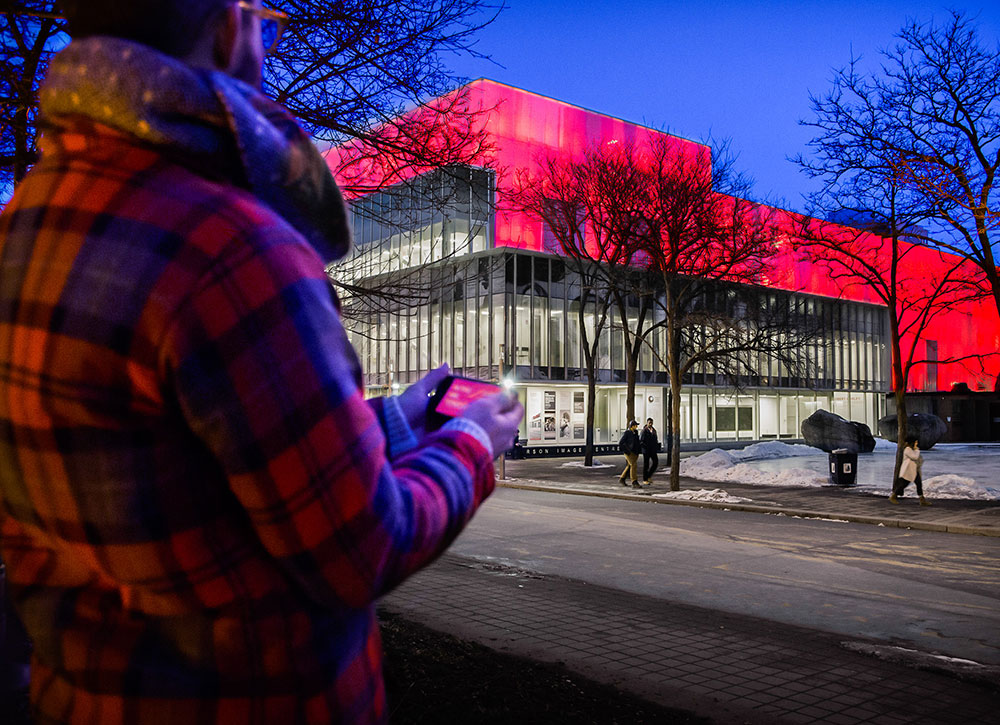
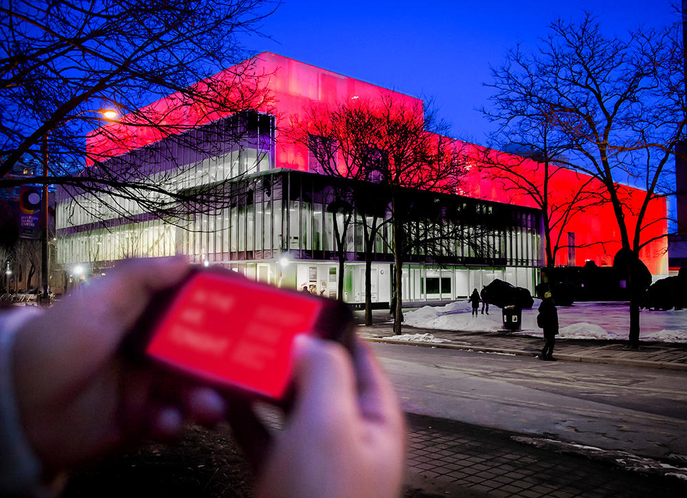
In the Air, Tonight
In The Air, Tonight is a month-long reactive architecture installation that transforms the LED façade of the Ryerson Image Centre into a glowing beacon that draws attention to and raises money for the growing problem of homelessness. Blue wave-like animations on the building react to the chilling winter wind, intensifying the experience of being exposed to the elements, while red pulses triggered by tweets with the hashtag #homelessness visualize the online conversation about this issue. Designed with Public Visualization Studio.
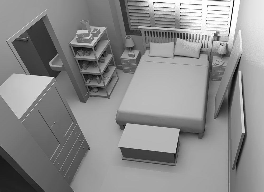
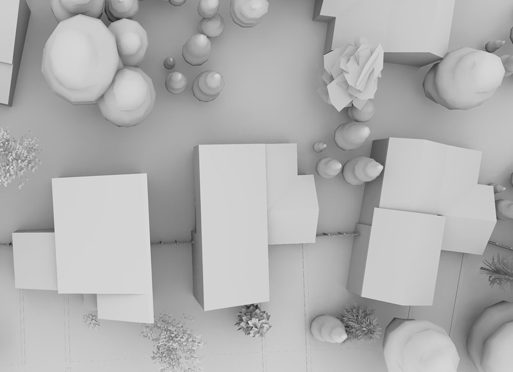
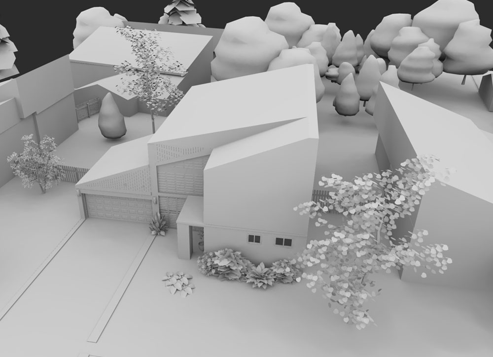
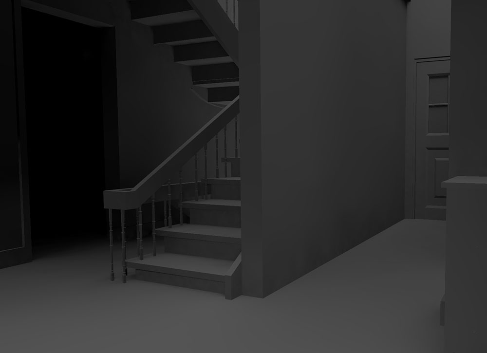
Improbable Cause
Editorial design for a story about three murders that happened at separate times in the same Mississauga home by Toronto Star feature writer Amy Dempsey. Based on floor plans, crime scene photography, and street view imagery, I created a fly through 3D model which was used as a story telling device to guide readers through the crime scene. Modelling done in SketchUp, rendering in Kerkythea and exported as a video sequence.
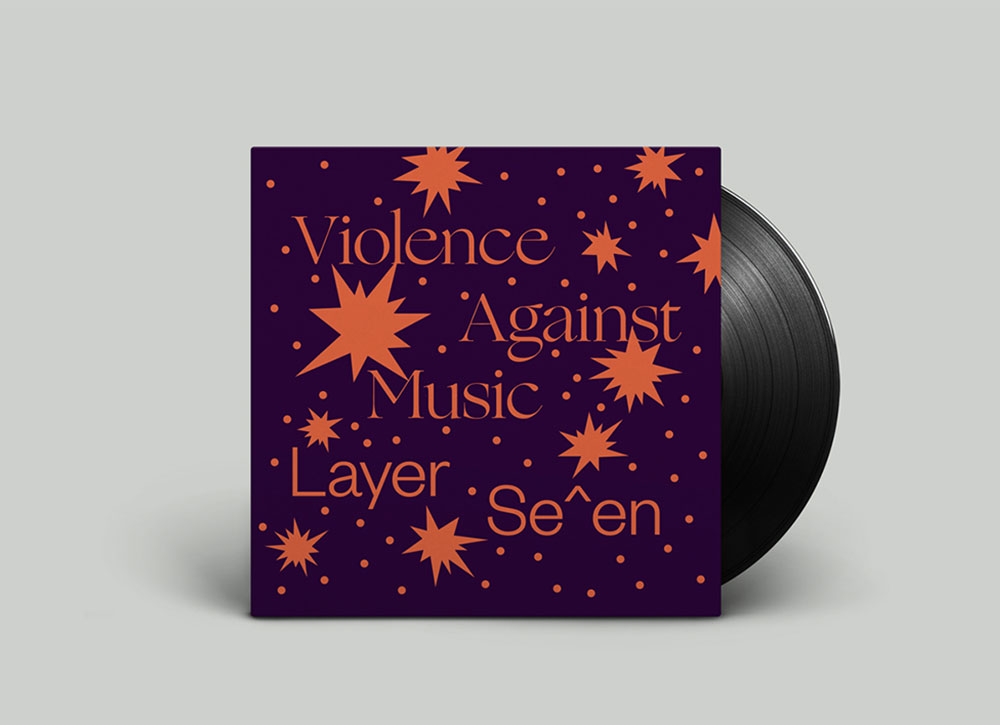
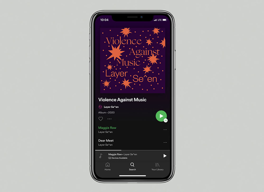
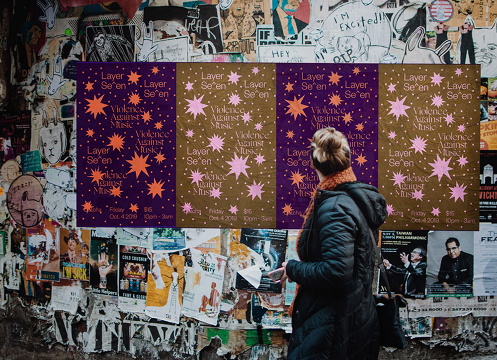
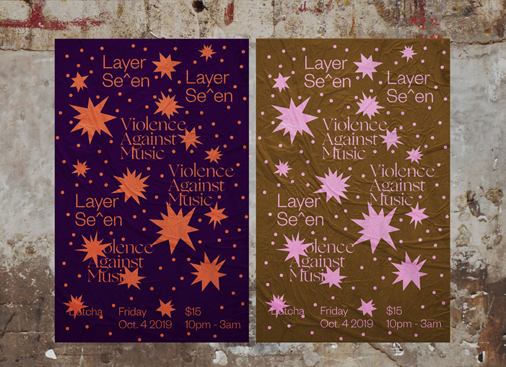
Layer Se^en — Violence Against Music
Album cover and posters designed to accompany Layer Se^en's debut album Violence Against Music.
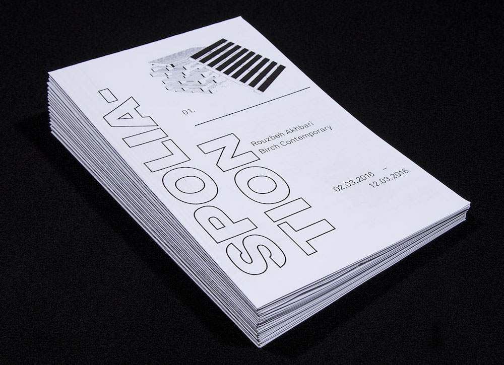
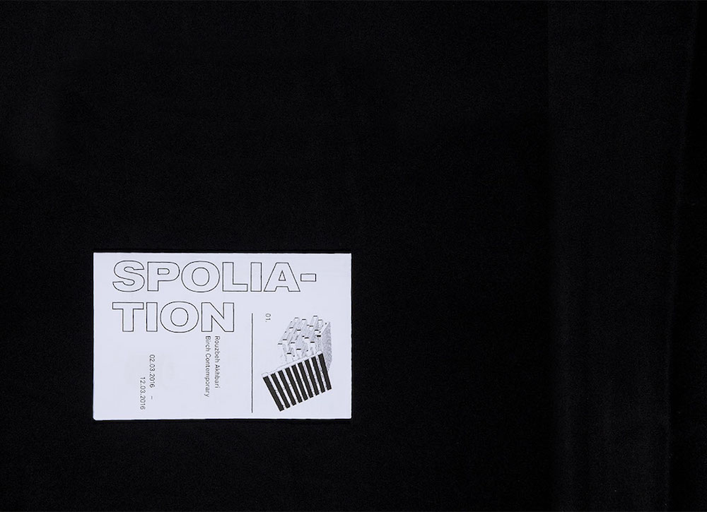
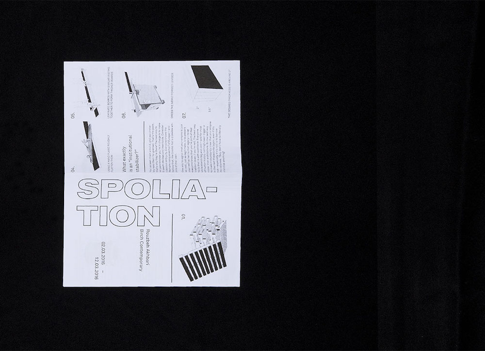
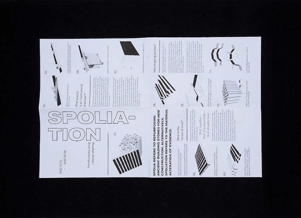
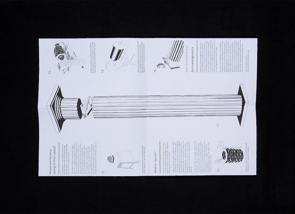
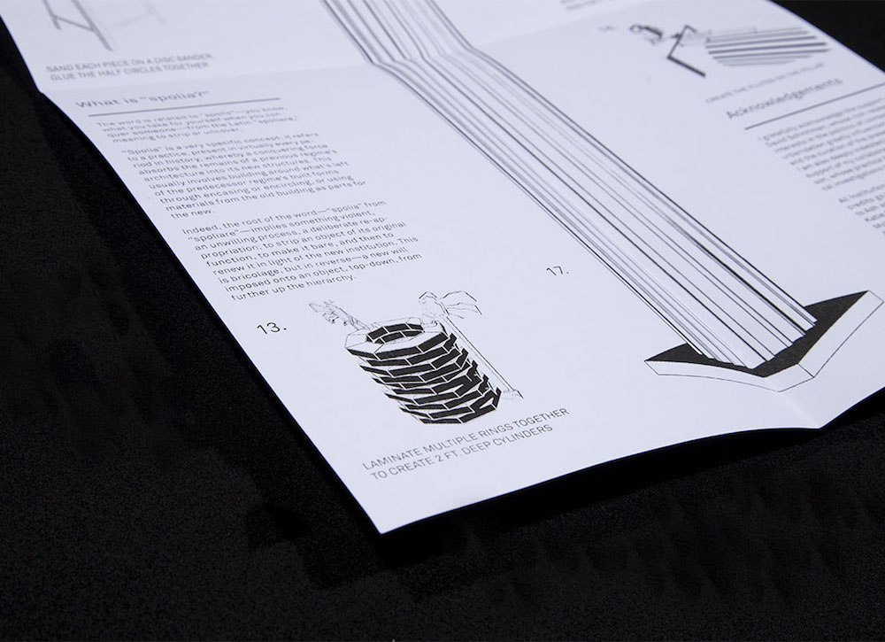
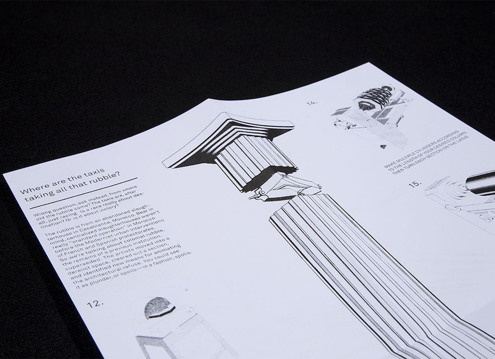
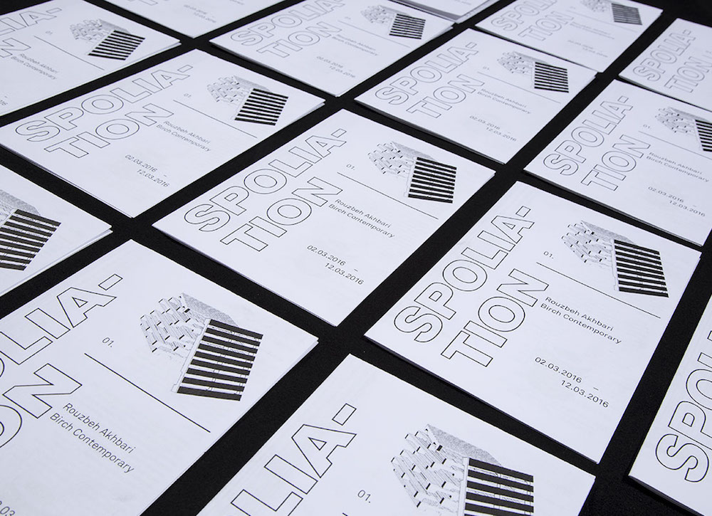
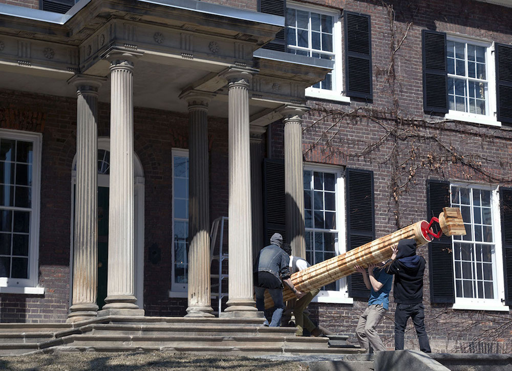

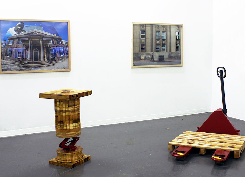
Spoliation
A catalogue designed to accompany artist Rouzbeh Akhbari's show Spoliation at Birch Contemporary. The latin word spolia refers to the practice whereby a conquering force absorbs the remains of a previous regime’s architecture into its new structures. The catalogue acts at a step-by-step manual to transform shipping pallets into an architectural feature – a Doric column – that acts as an ‘Institutional Stabilizer’ in downtown Toronto. The reader is encouraged to follow instructions to make and install their own columns in the urban landscape.